TableMaster / Live Cards · TM-362
One Elementor setting fixes the leaderboard card on phones.
On a phone, the leaderboard card on betatjacks.com fills only part of its box. A copy of the page does the same, and one Elementor setting for phones makes it fill the box.
The fix. On phones, the box that holds the card has its
Columns set to 1 with no unit. Browsers ignore that value,
so the column shrinks to 300 px, the starting width of every embedded
frame. In Elementor, set the box's Mobile Columns to 1 FR.
Side by side
Each copy is the live leaderboard page, saved on 20 October, with the current RoomDirector snippet in the box. Open a copy on a phone to see it live.
Your phone, 19 October
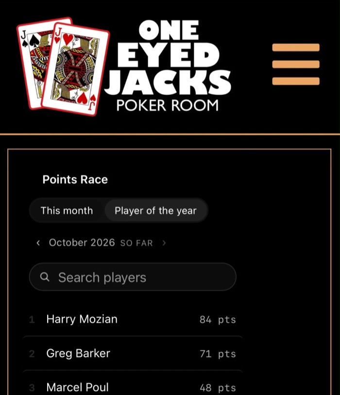
Copy of the page today
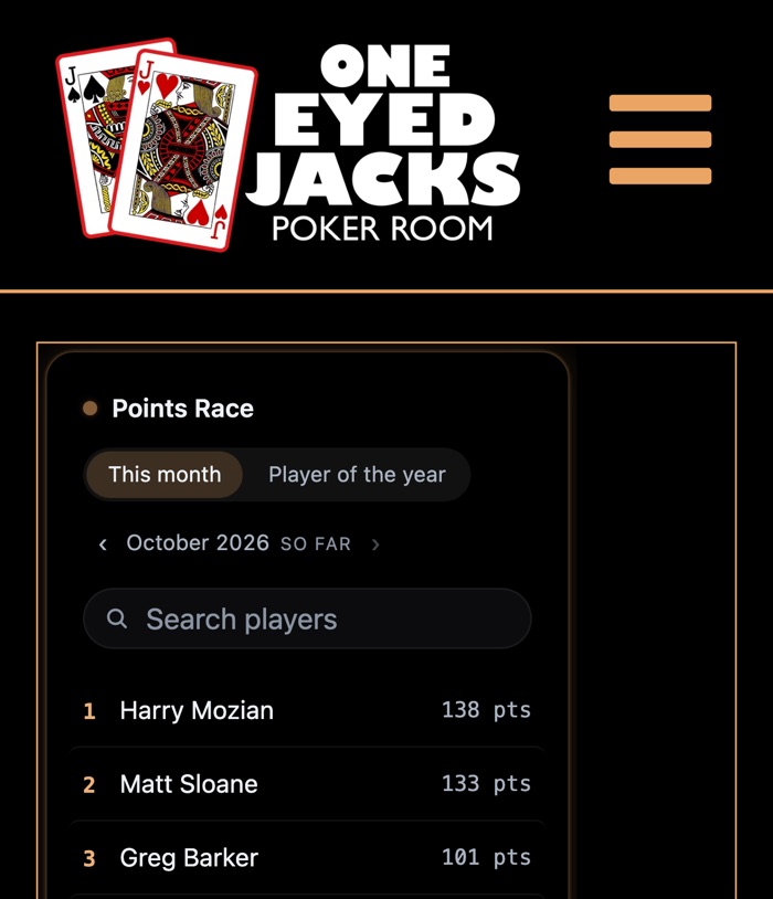
Open this copy
With the fix
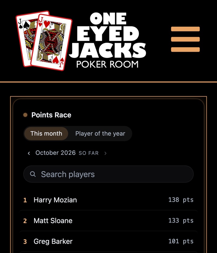
Open this copy
The box's Columns on Mobile
The leaderboard box is an Elementor grid container. Its Columns value is set per screen size, and only the phone value is broken.
| Screen | Columns on the page | The card |
|---|---|---|
| Desktop | 1fr | Fills the box, 1198 px of 1200 |
| Tablet, 1024 px and under | repeat(1, 1fr) | Fills the box, 718 px of 720 |
| Phone, 767 px and under | 1 | 300 px of 390 |
With no usable Columns value, the column is only as wide as what is in it. The old points table had wide rows, so it pushed the column to the full 388 px on a phone. An embedded frame starts at 300 px, so the column stops at 300 px.
In Elementor
- Open the Leaderboard page in Elementor.
- Switch the editor to Mobile view.
- Click the box with the orange border that holds the card.
- On the Layout tab, find Columns. Its unit menu shows Custom: change it to FR, with the number 1.
- Click Update.
Compiled 20 October 2026 from betatjacks.com/leaderboard and its style file as served that morning, the Elementor help page Layout options using a grid container, and the Live Cards code. The copies were measured in a 430 px iPhone-size browser.
Covers the leaderboard page only.